
The DIY-namite! Responsive Website
The Problem: First-time homeowners often have very limited budgets and cannot always afford to hire someone to repair and maintain their home.
The Solution: Design a responsive website that allows users to search home repair and maintenance tutorials. My DIY-namite! website contains a searchable database of home maintenance tutorials, as well as articles and tool reviews for users wishing to learn DIY home repair. It will be an invaluable tool for users with limited budgets and a desire to be independent.
Project Duration: August 2023-September 2023
My Role: Web Designer designing an original DIY home maintenance responsive website from conception to delivery.
My Responsibilities: Conducting interviews, creating personas, paper and digital wireframing, low- and high-fidelity prototyping, conducting and moderating usability studies, accounting for accessibility, and iterating on designs.
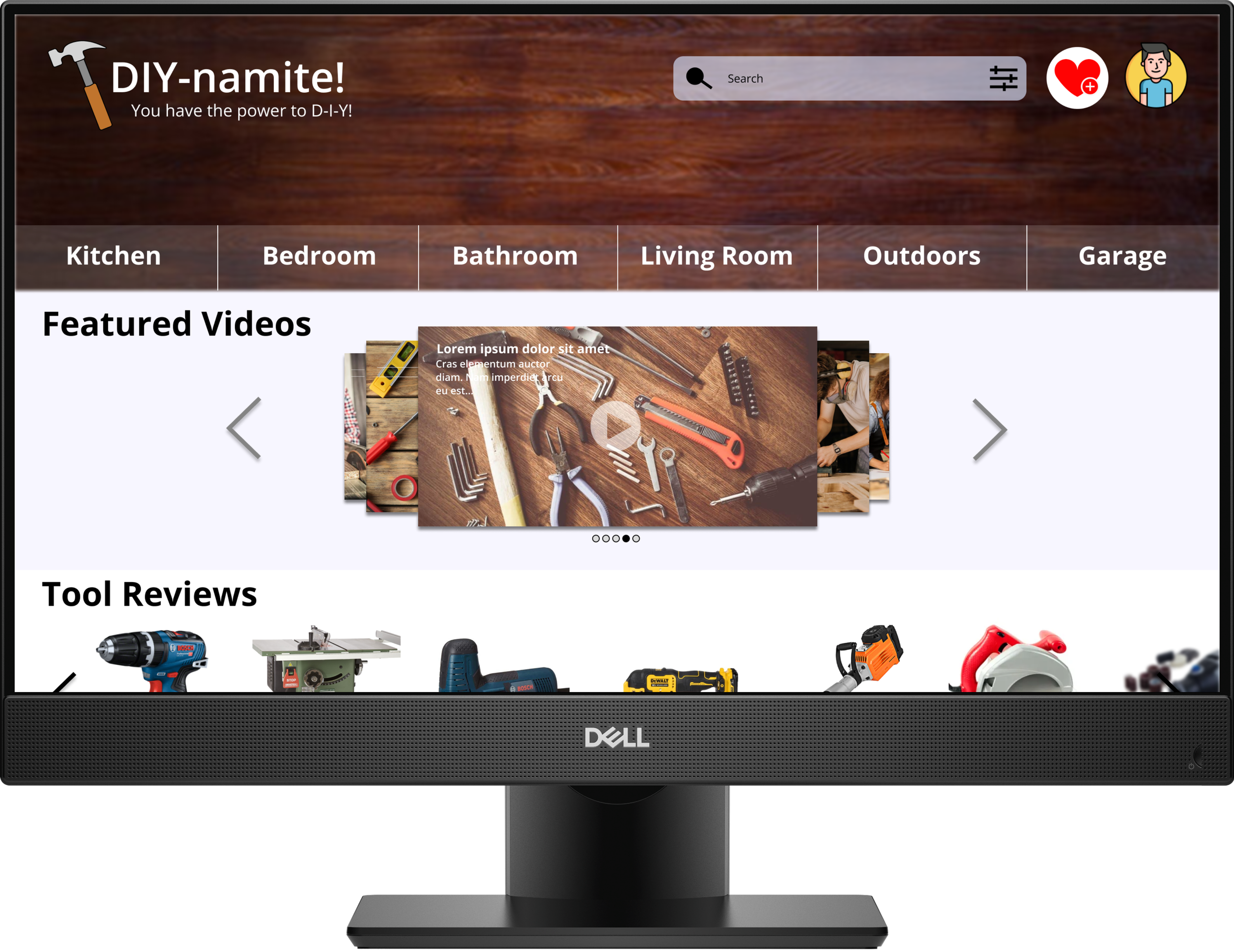
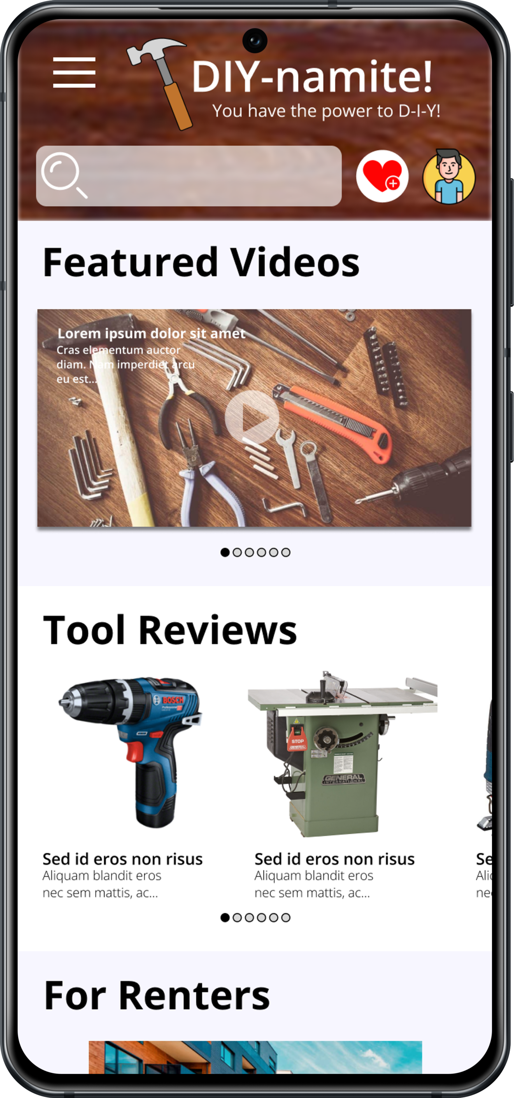
Current Design

My focus for this project was gearing toward college-aged adults. I still wanted to create something simple enough for users of all ages to utilize, but through my research I learned that many first-time homeowners are between the ages of 20 - 40 years old. I reflected my findings in the overall user experience of my website design.
Sitemap
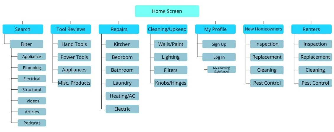
I spent a fair amount of time during my competitive audit scanning existing DIY resources to find out what market gaps I wanted to fill, and what additional services I wanted to provide for my prospective users. I took my findings and used them to create this organized sitemap for my prototype.
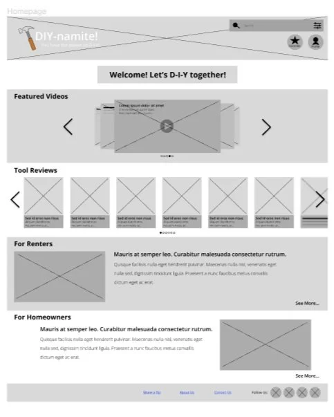
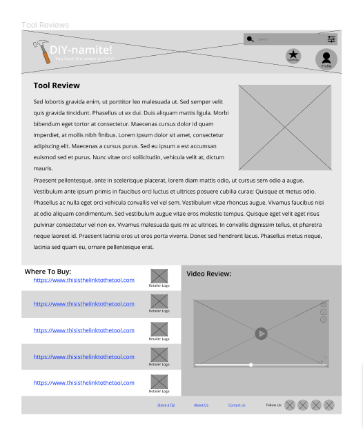
Early Sketches and Wireframes
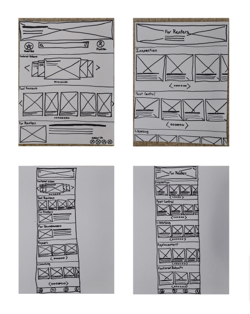

The most challenging problem I faced when designing my wireframes was figuring out how to arrange the most important information on the front display of the Android iteration, and which parts of the homepage would best be placed into a burger menu. At first I tried cramming too much onto the main display in order to make it look just like the desktop version. But I quickly learned how awful the user experience would be if I didn’t iterate further. After multiple iterations, I figured out a simplified homepage with extended options in the burger menu, and I used that design moving forward.
Usability Testing Insights
Through my usability study, I found that the search bar had been placed front-and-center, which confused my users and distracted them from looking for other features they desired to find within the user flow. After reiterating my wireframes, I moved the search bar to the top of the page and decreased the size so that it would be less distracting, but still easy and intuitive to find.
Final Design

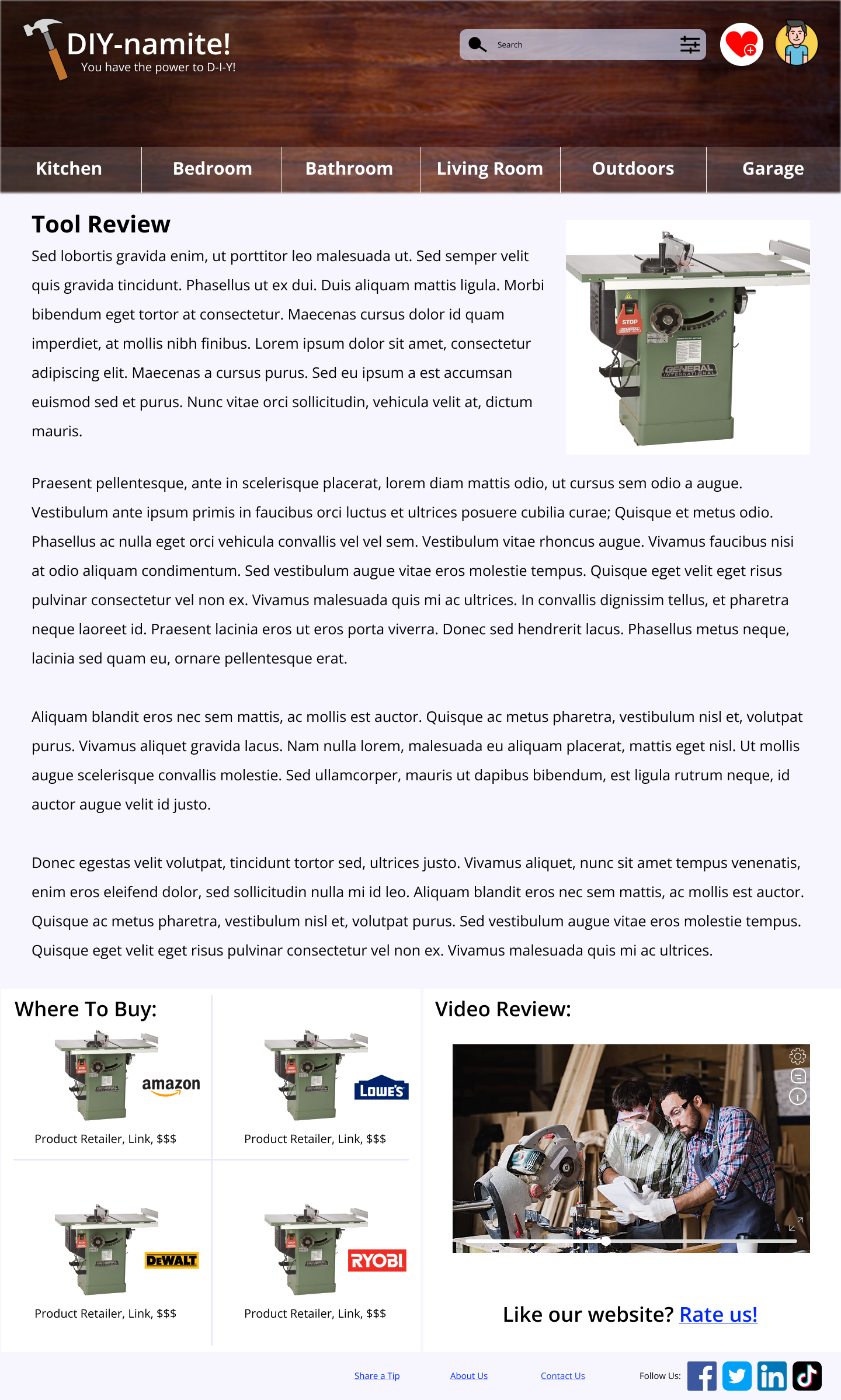
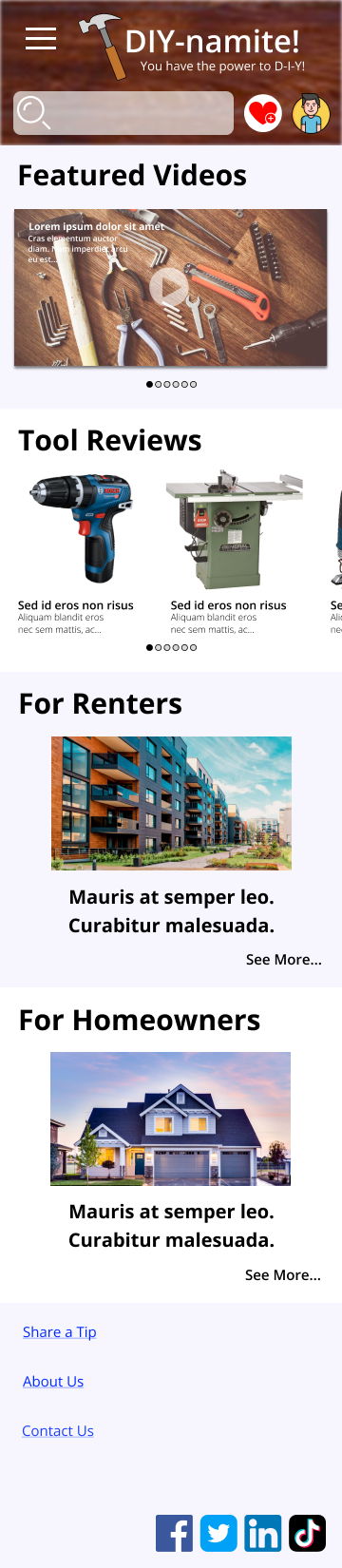
I polished my user flow and developed it into a simple high-fidelity prototype, then conducted a second round of user testing to ensure the overall user experience achieved its intended goals. Users expressed delight with the clean and simple UI, as well as excitement over the variety of features provided in the website’s user flow.
Next Steps
Conduct further usability testing and incorporate feedback into further refinement of overall design
Create additional pages within the prototype to maximize real-world example of design
Conduct further competitive audits to ensure most important features have been included.