
The Library Self-Checkout System
The Problem: Library Patrons are experiencing common pain points when using the current Library self-checkout system.
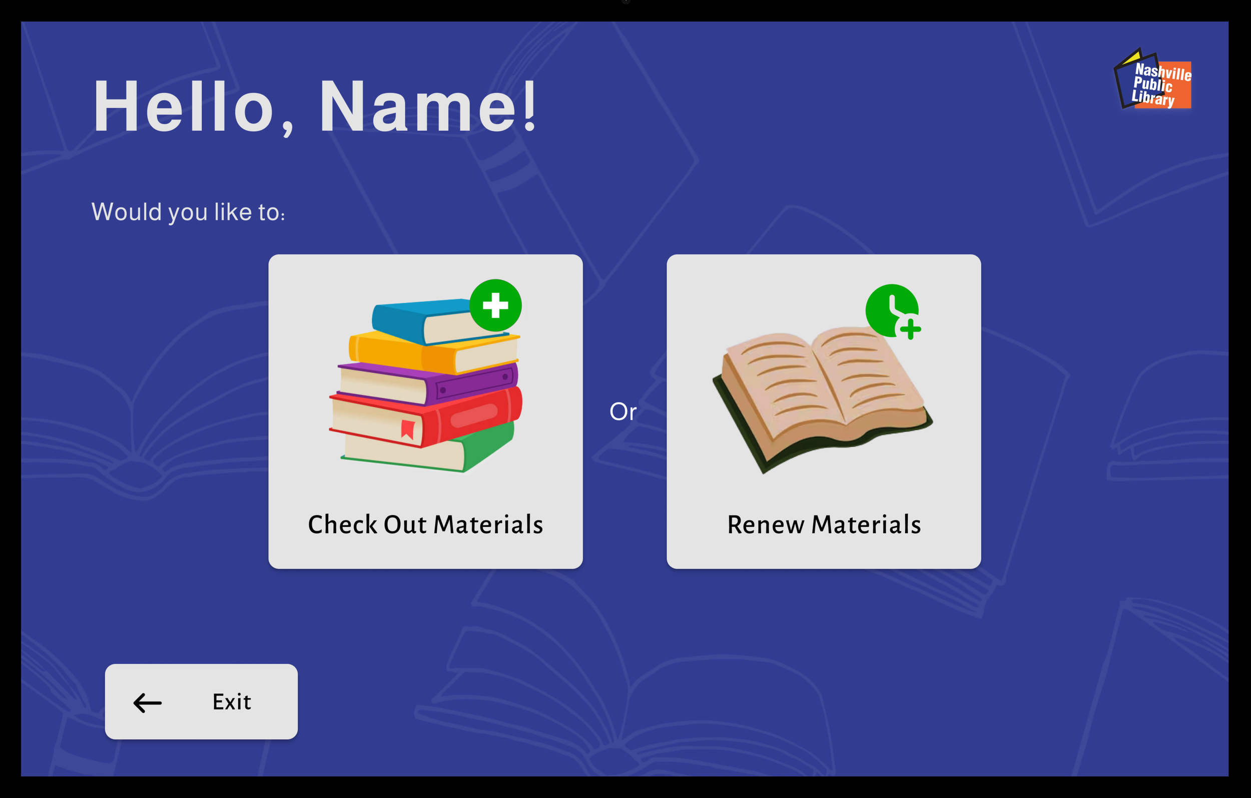
The Solution: Design a simplified self-checkout interface with special focus put toward an intuitive user flow and engaging UI. My Library Self-Checkout design offers an easier and more satisfying way for users to check out and renew their library items. It eases confusion regarding certain prompts and error messages, while engaging Library patrons through the use of warm, friendly language and a pleasant color palette.
Project Duration: April 15-19, 2024
My Role: Web Designer creating an original library self-checkout system from conception to delivery.
My Responsibilities: Conducting user interviews and competitive audits, creating personas, paper and digital wireframing, low- and high-fidelity prototyping, conducting and moderating usability studies, accounting for accessibility, and iterating on designs.
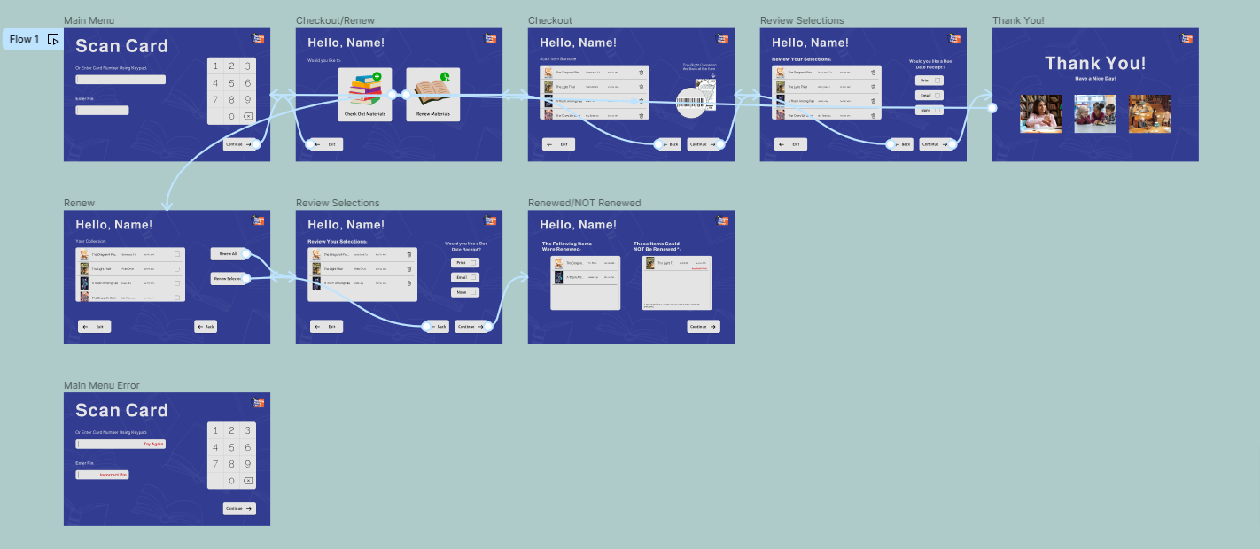
Current User Flow
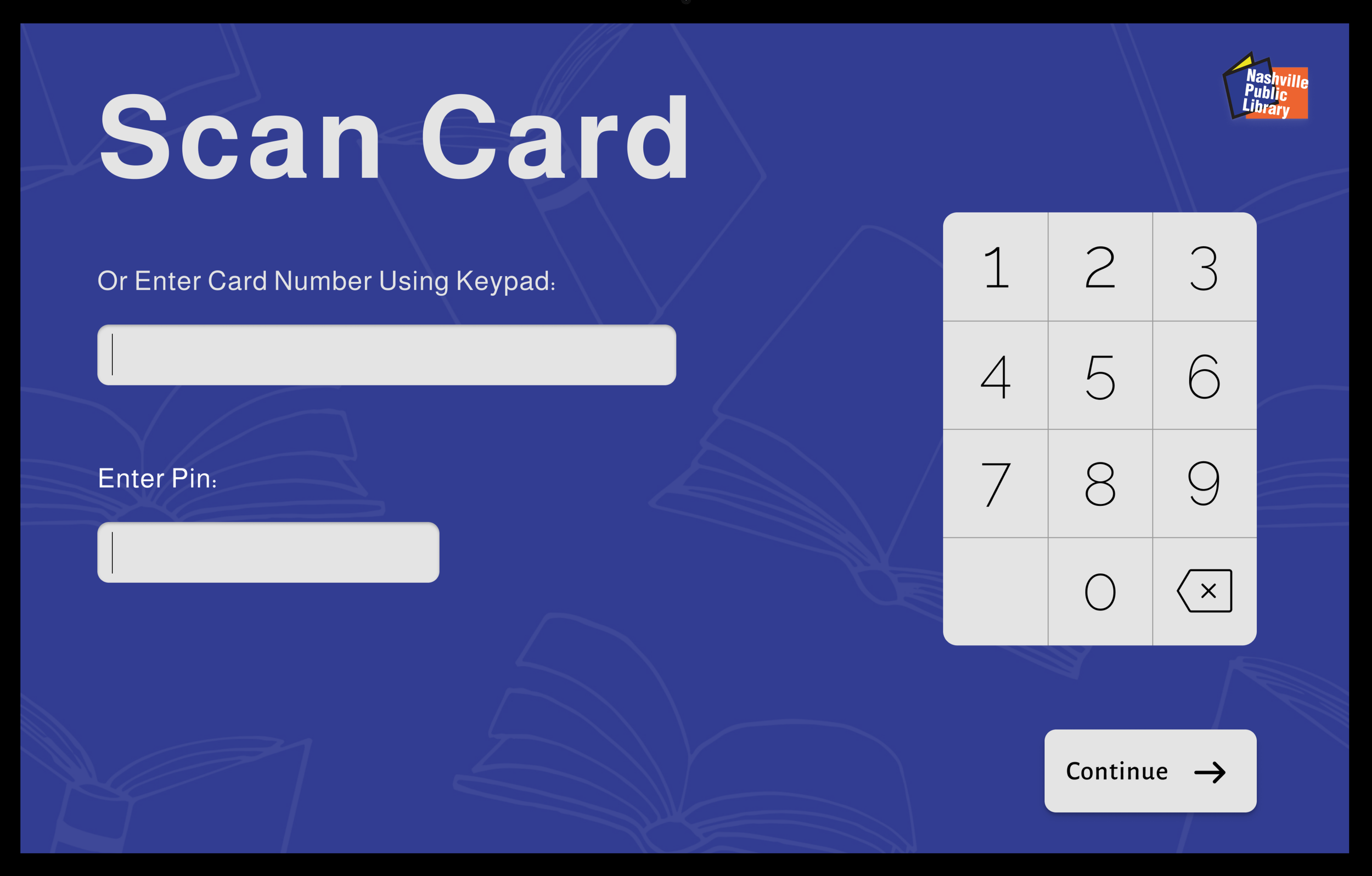
When designing this system, I already knew my audience very well through months of observation and note-taking: My main user demographic consisted of persons 45 years and older. So I created a user flow that takes their common abilities and limitations into consideration — by creating large buttons, using large sans-serif font styles, and simplifying the flow wherever possible to prevent confusion.
Early Sketches and Wireframes
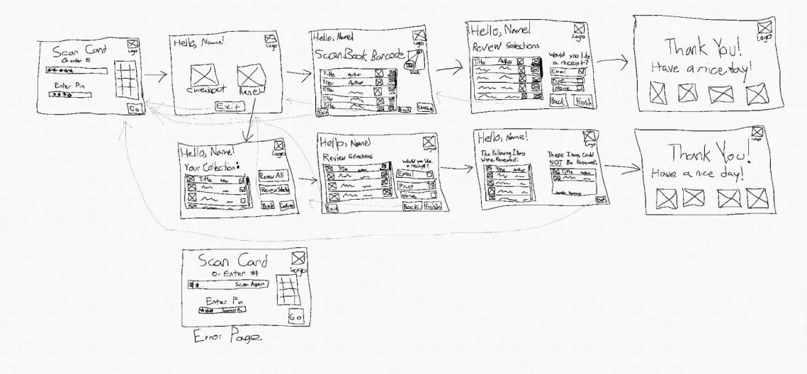
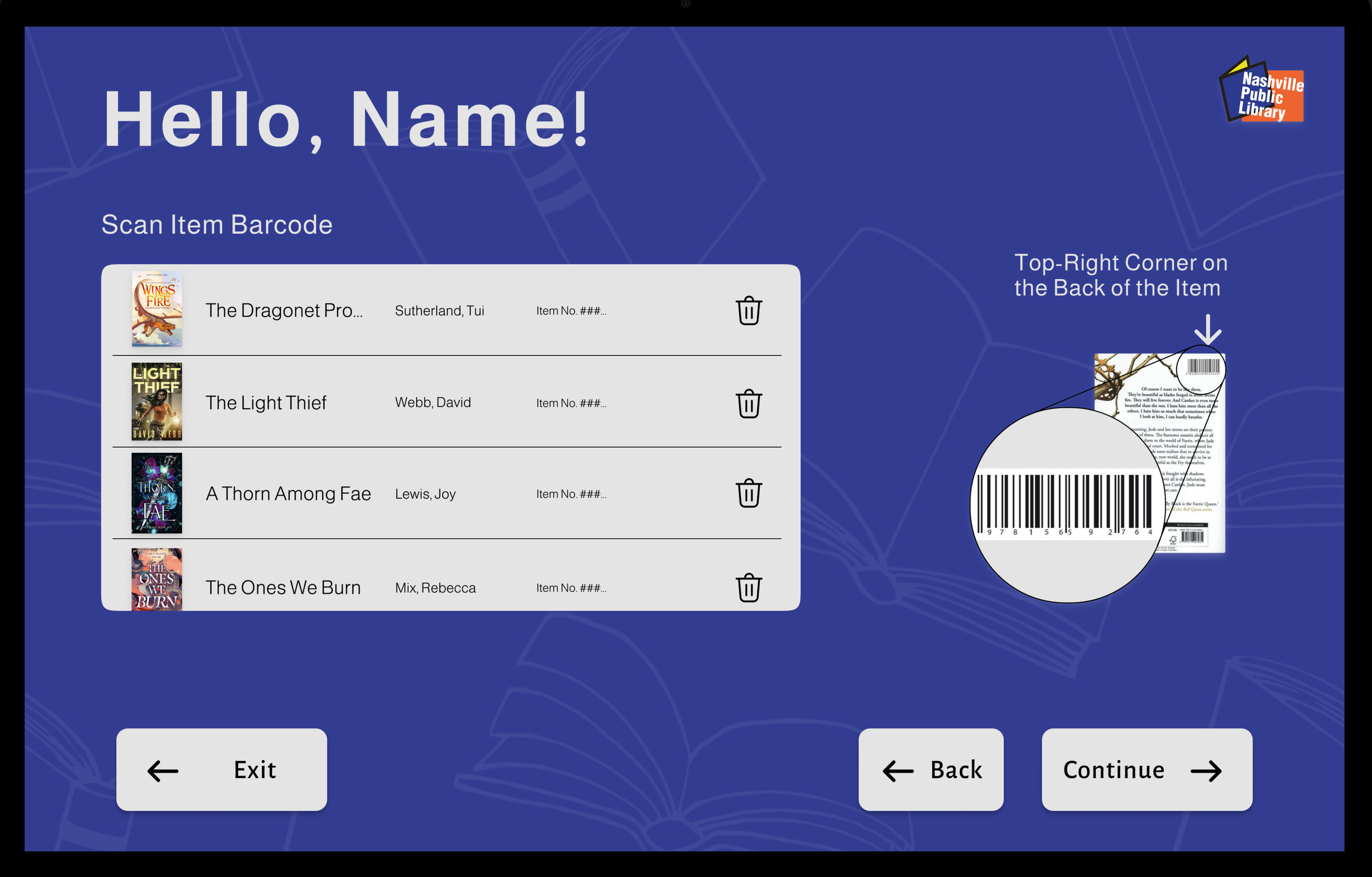
The main challenge I faced when sketching and wireframing this flow, was figuring out how to display all relevant information in a way that wouldn’t appear crowded or overwhelming to users. I overcame this by taking notes on what the main objectives of each page were, then translating them to my wireframes so that everything would be included, yet concise in its display of information. I also used graphics more than text to communicate other features and how to use them.
Usability Testing Insights
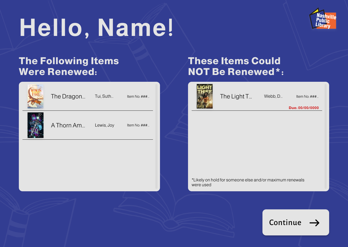
User testing of my low-fidelity mockup revealed that there was no reason given for why certain items could not be renewed. I amended my design and added an asterisk at the bottom of the “Not Renewed” window to indicate the likely reasons for nonrenewable items. I also added a red due date reminder for those items so patrons would be aware of the date they must return their items by.
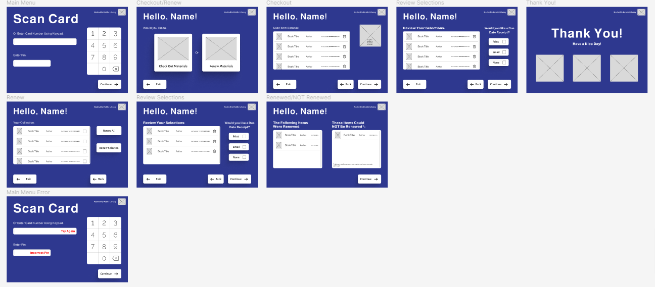
Final Design
After implementing the design changes needed following user testing, I tweaked a few final details within my prototype and created a second user flow for a monitor with different dimensions, to showcase my design’s responsiveness.
I also presented my finalized prototype to my local library and they agreed that the overall user experience was much better than the system currently in place!
Next steps would be to present my design to the library’s software vendor and ask if they would be interested in developing it so that the library may implement it.
View the interactive Library Self-Checkout System prototype here!